Overview
MMIT was evolving from a data provider to a strategic partner in the pharmaceutical space. The rebrand needed to reflect this shift and communicate their role in guiding companies through complex patient and market access journeys.
MMIT was evolving from a data provider to a strategic partner in the pharmaceutical space. The rebrand needed to reflect this shift and communicate their role in guiding companies through complex patient and market access journeys.
Challenge
MMIT’s previous identity didn’t reflect their evolution into navigators who guide partners from complexity to clarity. The brief was to visualise data, pathways and patient journeys in a way that felt human, intentional and rooted in the core brand idea: illuminate the path.
MMIT’s previous identity didn’t reflect their evolution into navigators who guide partners from complexity to clarity. The brief was to visualise data, pathways and patient journeys in a way that felt human, intentional and rooted in the core brand idea: illuminate the path.
Approach
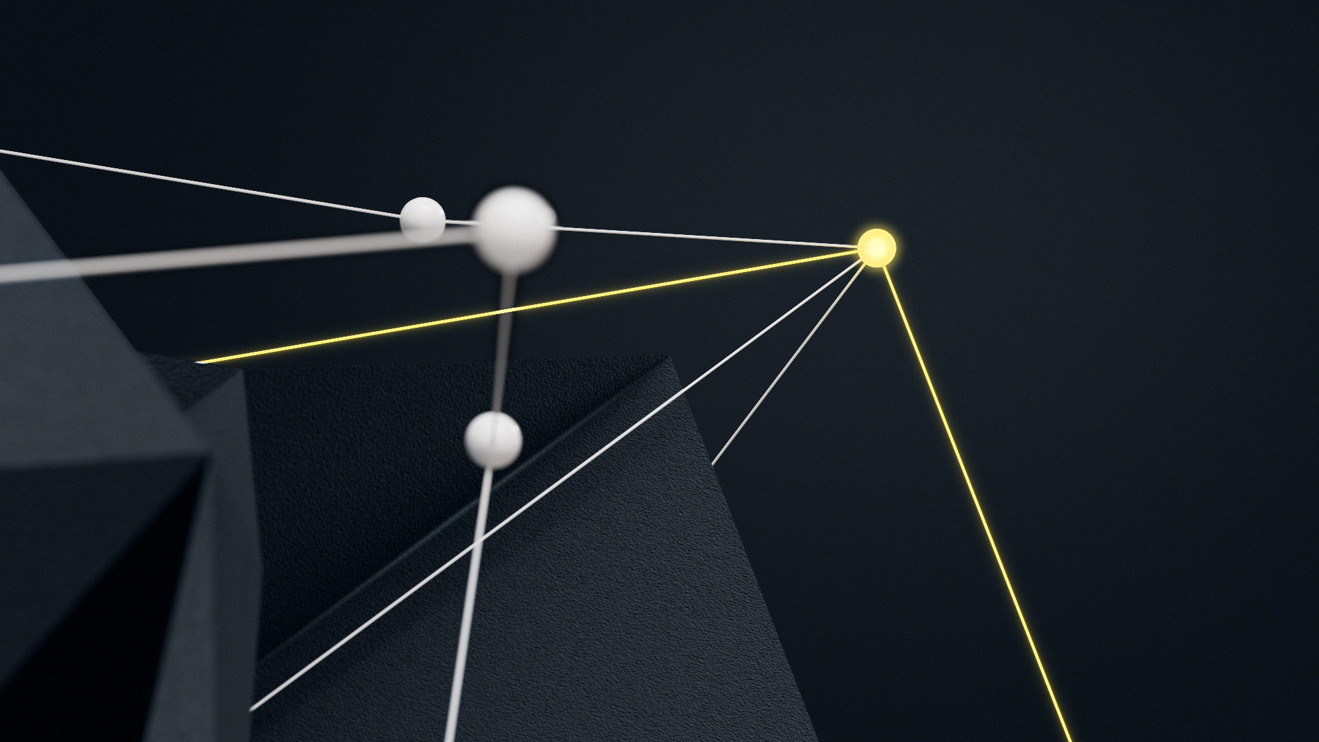
The motion direction centred on the metaphor of illuminating the path, using light and evolving pathways to turn abstract data into clear, guided journeys. This visual idea expressed MMIT’s role as a trusted partner helping pharmaceutical companies navigate complex decisions.
As the brand motion designer, I defined and developed the 3D motion identity, shaping how the rebrand translated into motion while maintaining the clarity and reassurance of the wider brand system. The process began with storyboarding and visual R&D to explore how light, movement and pacing could communicate guidance rather than overwhelm. From there, I built the motion system across the hero film, logo behaviour, transition principles and a reusable lower third framework designed to scale across communications.
The animation language focused on controlled and deliberate movement. Light reveals, directional flows and steady transitions were used to move viewers from complexity towards understanding. Sound design was developed alongside the visuals to reinforce rhythm and clarity, ensuring every moment felt intentional and supportive of the narrative.
Outcome
The final film successfully launched MMIT’s new identity, reinforced their market positioning, and became the foundation for ongoing brand communications.
The final film successfully launched MMIT’s new identity, reinforced their market positioning, and became the foundation for ongoing brand communications.